 |
|
 |
 |
|
|
Joined: Jan 2004
Posts: 22,934 Likes: 4
BellaOnline Editor Highest Posting Power Known to Humanity
|
OP

BellaOnline Editor Highest Posting Power Known to Humanity
Joined: Jan 2004
Posts: 22,934 Likes: 4 |
Post your ebook cover image here to get feedback and advice on it! Here's the two I just loaded up, for my two free recipe books - 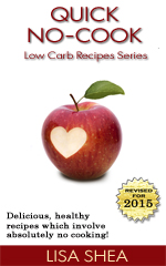 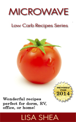 I'd love feedback on these! Post your own image so we can offer ideas!
|
|
|
|
 |
 |
|
 |
|
|
|
|
|
|
Joined: Jun 2010
Posts: 1,005
BellaOnline Editor Parakeet
|
|
BellaOnline Editor Parakeet
Joined: Jun 2010
Posts: 1,005 |
LOL, beautiful, but I was secretly hoping for magic low-carb pecan pie or chocolate brownies! Love the heart, btw. You could continue the theme by putting one on the tomato, but what color would it be???  I think sharing covers ahead of time is a GREAT idea, too.
|
|
|
|
|
|
|
|
|
|
|
|
|
|
Joined: Jan 2004
Posts: 22,934 Likes: 4
BellaOnline Editor Highest Posting Power Known to Humanity
|
|
OP
BellaOnline Editor Highest Posting Power Known to Humanity
Joined: Jan 2004
Posts: 22,934 Likes: 4 |
Dear Cheryll - The apple photo came that way from iStock, I didn't photoshop that. I'm not sure if it would look as nice photoshopped, or at least my graphic skills are fairly pitiful. It took a serious effort just to make the covers look half decent and I know they still could use improvement. I am simply not a graphically minded person and I accept that. I just redid my low carb charts ebook - my top seller - and this is its new cover - 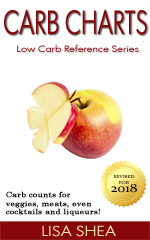
|
|
|
|
|
|
|
|
|
|
|
|
|
|
Joined: Jan 2004
Posts: 22,934 Likes: 4
BellaOnline Editor Highest Posting Power Known to Humanity
|
|
OP
BellaOnline Editor Highest Posting Power Known to Humanity
Joined: Jan 2004
Posts: 22,934 Likes: 4 |
Here's the other high selling ebook I have, that I've updated the cover on. Now all four match and look as if they're part of a series, which they are. I'm aiming for a consistent look  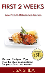
|
|
|
|
|
|
|
|
|
|
|
|
|
|
Joined: Nov 2010
Posts: 174
Jellyfish
|
|
Jellyfish
Joined: Nov 2010
Posts: 174 |
Those are gorgeous, Lisa. The right image on a simple cover really pops!
|
|
|
|
|
|
|
|
|
|
|
|
|
|
Joined: Apr 2002
Posts: 4,906
Elephant
|
|
Elephant
Joined: Apr 2002
Posts: 4,906 |
Those are beautiful and I agree about making the cover easier to read. Mine look more like real book covers and are hard to read so I need to update them.
I personally prefer the 2d or 3d look better than just a flat look for my ebooks (no judgement on anybody else's stuff that is just my preference) and I can change the cover of both my ebooks to look more like a 2d report cover instead of a book cover which would make it easier to read and I would be happy with that as well.
Is there a way to create a 2d image with paint or will I have to find myself a special ebook cover software to do that? My current ebook software seems to be not compatible with my new computer : (
I only paid $17 for it and already checked and no updates so now I have to find a new software. Any recommendations (preferably inexpensive or free)?
I love my covers. I just need to make them easier to read.
|
|
|
|
|
|
|
|
|
|
|
|
|
|
Joined: Jan 2004
Posts: 22,934 Likes: 4
BellaOnline Editor Highest Posting Power Known to Humanity
|
|
OP
BellaOnline Editor Highest Posting Power Known to Humanity
Joined: Jan 2004
Posts: 22,934 Likes: 4 |
Dear Cricket -
Thanks so much!
Yes the key with online sales is to keep in mind that many people will only see the thumbnail while they make their sales decision. They might only see the tiny version of the image on a Facebook link and use that to decide to click. That tiny version has to be clear and sharp. The cover needs to be clear and readable at that small size.
In our world of ebooks, most people will never see a large version of the cover. So what matters for sales conversions is that small image.
|
|
|
|
|
|
|
|
|
|
|
|
|
|
Joined: Jan 2004
Posts: 22,934 Likes: 4
BellaOnline Editor Highest Posting Power Known to Humanity
|
|
OP
BellaOnline Editor Highest Posting Power Known to Humanity
Joined: Jan 2004
Posts: 22,934 Likes: 4 |
Dear Monica -
I understand completely about enjoying a 3D look. I used to add shadows to all my ebook cover images and I think the training for ebooks still talks about doing that. Over the years though I found that I wanted to absolutely maximize the amount of space I had available, to deliver my message. That is, if Facebook is going to turn my image into only 90x90, I didn't want a portion of that space "wasted" on my 3D effects and therefore have even less space remaining for my actual message. I wanted every iota of space to go towards making my message as large and clear as possible.
What I would suggest for your ebooks is to have a two pronged approach. For the "cover icon" I would use a flat view that gave a super sharp clear impression of what your book is about. When people go to Amazon it's always a flat image of the cover they see for this reason, so the thumbnails at the bottom of the "you might also like" are crystal clear and alluring. So this is a specific purpose. This icon is used in thumbnails and facebook promos and it needs to get that "banner ad" style message across very clearly.
Then *in addition* to that promo icon, you can have a pretty, larger version of your cover in 3D in your actual description of the ebook, where people have more space to ponder and read. Right align it so it doesn't interfere with the reading of your description, but that way you can have the aesthetic impact you're looking for. And at the larger size, it might actually be readable.
I don't think there's any way to take a 3D slanted image and to "Unslant" it with software that is going to create a crisp, clear image. Maybe let us know what the software is and we'll see if anyone else is using it? You could send them the file and they could have the software output a 2D version for you to then use.
|
|
|
|
|
|
|
|
|
|
|
|
|
|
Joined: Feb 2003
Posts: 14,392
BellaOnline Editor Highest Posting Power Known to Humanity
|
|
BellaOnline Editor Highest Posting Power Known to Humanity
Joined: Feb 2003
Posts: 14,392 |
I also agree with Monica about shadows and drop shadows, to make an ebook look more like a 'real life thing' - it seems more psychologically appealing.
I do get it about maximizing space though for tiny compressed images.
I like the strawberry image the most.
I am wondering if the series would be better if all the font colors are the same? I found the light text on the tomato cover a little distracting.
|
|
|
|
|
|
|
|
|
|
|
|
|
|
Joined: Jan 2004
Posts: 22,934 Likes: 4
BellaOnline Editor Highest Posting Power Known to Humanity
|
|
OP
BellaOnline Editor Highest Posting Power Known to Humanity
Joined: Jan 2004
Posts: 22,934 Likes: 4 |
Dear Jilly - Intriguingly the only reason I used that chocolate covered strawberry is a certain someone here in this forum asked for chocolate on the cover I was going for healthy items so that was my compromise. I do think it's nice that it has a sense of "motion" to it where the rest are static. It's an intriguing thought about the series having all the same color fonts. My thought on that goes along these lines. Each cover has to be absolutely perfect on its own because this could be the first cover a person sees and their sole decision could be whether to click on that cover or not. So the cover has to be ideally optimized for the color match between the item and title. If I used a non-matching color for the tomato they wouldn't realize it was because of a series, they would just see that the color wasn't a match and the effect would be less powerful. The cover I like a lot that is on this same theme has grey letters - Good Calories Bad CaloriesBut I didn't want to go that route. Still, as I was playing with color choices for the title (for *far* too long!!) I found that bright colors seemed to look non-professional to me. The very muted ones gave the more professional feel, to my eyes. So that's how I ended up with that one. When I made it a stronger color it no longer felt like a professional cover to me. Maybe I should make it a greyer color of tomato-orange ... Lisa
Last edited by Lisa LowCarb / VideoGames; 10/16/11 02:56 AM.
|
|
|
|
|
|
|
|
|
|
|
|
|
We take forum safety very seriously here at BellaOnline. Please be sure to read through our Forum Guidelines. Let us know if you have any questions or comments!
|
|
|
|
|
|
|
|
|
|
|
|
This forum uses cookies to ensure smooth navigation from page to page of a thread. If you choose to register and provide your email, that email is solely used to get your password to you and updates on any topics you choose to watch. Nothing else. Ask with any questions!
|
|
|
|
|
|
|
|
|


