As for covers, I agree with Jilly on your science fiction cover. Unfortunately, to me, it looks self-published with all the stigma still attached to that, if unfairly. I do like the more streamlined font that you changed it to. But the abstract design of exploding light doesn't engage me. One of the reasons I think readers avoid science fiction is because they think it will be all ideas with no real character depth or development. If you could work in some people, even if it was just tiny figures in a landscape like the old Frank Herbert DUNE covers, then I'd be more intrigued as a reader.
(If you still need beta readers for your science fiction novel, I could do it. Word document or PDF is fine if you want to email me an attachment.)
Weren't those Heinlein covers awful? Poor devil might not have had control over his cover art, though, and had to take what he was given, especially on the early stuff.
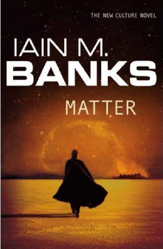
One cover that I thought was just gorgeous was Iain Banks' cover for MATTER. The colors were so rich, the design simple and elegant, and the figure so mysterious.